The Best Kitchen Cabinet Colors, and Who Each One Is Actually For
KitchenGPT7 August 20265 min read
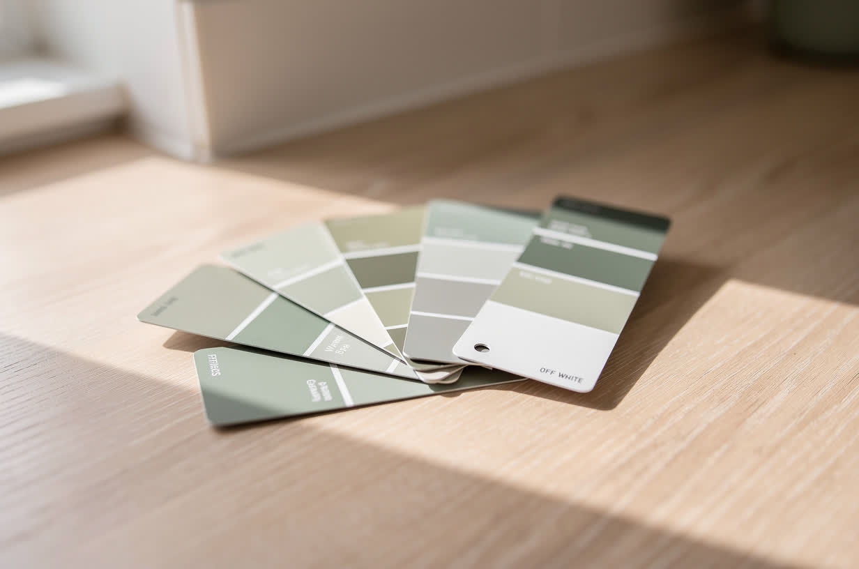
Every list of the best kitchen cabinet colors has the same problem. It ranks colors, and colors cannot be ranked.
The same green that looks calm and expensive in a bright south-facing kitchen looks gray and cold in a north-facing galley with one small window. Neither room is wrong. The color is just doing what colors do, which is behave differently depending on what is around them.
So this list is organized by who each color is for, not by which is best.
Two things decide almost everything: which way your kitchen faces, and what you are not replacing.
Warm white and off white
For: small kitchens, north-facing rooms, and anyone who wants the kitchen to disappear rather than announce itself.
Warm whites are the safest choice in the genuine sense: they go wrong least often. They reflect what light you have, they do not fight a floor you are keeping, and they age slowly.
The trap is picking the wrong white. Brilliant, blue-based white looks clinical in most homes and turns gray in low light. Whites with a little yellow, cream or gray in them read as warm and intentional. If you are going white, the decision is not "white or not", it is which undertone, and that is a much harder decision than it sounds. Our white kitchen ideas page goes through the combinations.
Soft sage and muted green
For: kitchens with reasonable natural light, wooden floors, and people who want color without commitment to a strong statement.
Muted greens are the most forgiving of the colored options because they sit next to wood, stone and brass without arguing. They also read as warm or cool depending on the light in the room, which is exactly why they are the most common source of "it looked sage in the store and lime on my doors".
If you are drawn to green, the specific shade matters more than with almost any other color, and the only reliable way to choose is at full size in your own light.
Deep navy and dark blue
For: kitchens with decent light, and rooms where the cabinets are only on one or two walls.
Navy does something useful: it looks considered and slightly formal, and it makes brass and warm wood look better than they do against white. It works especially well on base cabinets with something lighter above.
It needs light. In a room where every wall carries dark cabinets and there is one small window, navy stops being handsome and starts being heavy.
Warm gray and greige
For: anyone whose countertop or floor has a warm undertone, and who wants a neutral that is not white.
Greige is the neutral that gets on with the most things. It is also the one most often ruined by undertone mismatch: a gray with a green base next to a floor with a pink base will feel subtly wrong to everyone and be diagnosed by nobody.
Look at the sample flat, next to the floor, in daylight. That is where undertone shows.
Charcoal and near black
For: larger kitchens, plenty of light, and people who are confident.
Dark cabinets look expensive and hide marks well. They also absorb light, so the room needs some to spare. The safest way to use very dark colors is below the countertop only, with something much lighter above, which keeps the drama and gives back the light.
Natural wood, which is not a paint color at all
For: anyone whose existing doors are solid and in good condition.
Worth saying because the question is usually framed as which color to paint, and sometimes the answer is not to paint. If your doors are solid oak in good shape, stripping and re-oiling them is a real option, and wood is having a long moment for a reason: it does not date the way a painted color does.
Two-tone
For: rooms where one color is not solving it.
Darker below and lighter above is the reliable version. Island in a contrast color is the other. Two-tone gives you the color you want without committing the whole room to it, and in small kitchens it is often the answer when a single strong color feels like too much.
The colors that go wrong most often
Not colors to avoid, colors to be careful with.
- Cool gray in a north-facing room. The room supplies blue light, the color supplies blue undertone, and the result is colder than anyone intended.
- Brilliant white anywhere with warm bulbs. The bulbs push it yellow and it reads dirty rather than crisp.
- Very dark on every surface in a small room. Handsome in the photo, oppressive in the room.
- A strongly of-the-moment color on the most expensive layer. If a trend-led color is what you want, put it somewhere cheap to change. Doors are cheap to repaint. Countertops are not.
Narrowing it down without spending months on it
Most people can get to a shortlist of three in an afternoon and then stall there for weeks, because the last step is the hard one.
The reason is simple. The shortlist is made of colors that all look good in general. Choosing between them requires seeing them in your room, on your doors, next to your countertop, in your light. A sample card cannot do that, and neither can a photo of somebody else's kitchen.
That is worth solving properly rather than guessing at, because among homeowners who remodeled, 47% say they liked their home more before they did it.1 The color is not the only reason for that, but it is the decision people report second-guessing most.
Two practical ways to close it out:
- Paint a real sample board, not the wall. A piece of card, two coats, moved around the kitchen and looked at morning, afternoon and evening. Free, and better than a sample card.
- Put the color on your own kitchen on screen. Our cabinet color visualizer takes a photo of your kitchen and a photo of the color, and gives you your room back with the doors in that color and everything else untouched. It is the fastest way to get from three to one.
Do both if you can. The screen tells you whether the color works in your room. The painted board tells you what the paint is actually like.
Sources
- 47% say they liked their home more before they remodeled it. Clever Real Estate, Home Renovation Trends, October 2024. n=1,000 U.S. homeowners, surveyed 14 to 16 August 2024, margin of error plus or minus 3%. Read the survey
The guidance on which colors suit which rooms is craft knowledge from kitchen painting and interior design, not survey data.
See it on your own kitchen before you commit
Upload one photo. Change the cabinets, the floor or the tile, and get your own room back with everything else exactly where it was.
Try it on my kitchen30 days money back. Cancel in one click. Failed generations never cost credits.