Clean white surfaces
Cabinets and walls in the same soft white. Check white samples in your own light, because whites lean warm or cool and two that differ a little will show next to each other.
Less is more. Minimalist kitchens focus on essential elements and clutter-free surfaces.
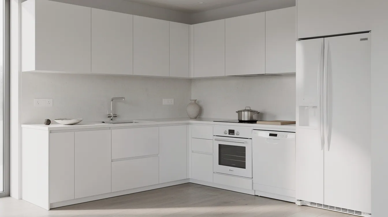
Minimalist kitchen design strips away unnecessary elements to focus on functionality and clean aesthetics. Every item has a purpose, surfaces are kept clear, and storage is cleverly concealed. The result is a serene, zen-like space.
Minimalist leaves the least room for error. With so few things in the room, every line, joint and shadow shows, and a crooked gap or a mismatched white is obvious. It also depends on habit, because the look only stays while the counters stay clear. Check it on your own kitchen before you plan the cabinets. See your own kitchen in it first.
Minimalist is not the same as empty. A bare kitchen with no storage is just an unfinished kitchen. These six things are what people are naming when they say minimalist.
Every object in view is one you use or one you chose on purpose. If you cannot say why something is on the counter, it does not belong there.
Empty wall, clear counter and open floor are part of the design. Negative space gives the eye a place to rest, so do not fill it.
White, light gray or beige, with a single accent at most. The calm comes from a few colors repeated, not from any one color.
Deep drawers, a full-height pantry and doors that close flush take the everyday mess out of sight. The look only lasts if the storage is big enough for what you own.
Matte finishes, honed stone and pale wood give depth without pattern. With no decoration in the room, texture is what stops it from feeling flat.
Door gaps, shelf heights and appliance edges line up. In a room with so little in it, a small misalignment is the first thing you see.
Get three of these right and the room reads minimalist. Get none of them right and it reads bare, which is not the same thing.
Cabinets and walls in the same soft white. Check white samples in your own light, because whites lean warm or cool and two that differ a little will show next to each other.
Drawers instead of base doors, a tall pantry wall, a cabinet for the small appliances. The goal is an empty counter on an ordinary weekday, not only on the day you tidy up.
Push-to-open catches or a recessed pull. With no hardware the fronts read as one plane and the eye has nothing to stop on.
One object carries the room: a pendant, a stool, a bowl, a piece of art. Choose one and leave the rest alone.
Keep one wall, or the upper half of one, free of shelves and decoration. The empty area is what makes everything else read as deliberate.
Two or three close tones from white through gray or beige. Use black only for thin lines, such as a faucet or a window frame.
Minimalist has close relatives that feel different in the room. If the plain version feels too cold, one of these may be closer to what you want. Each one has its own page.
Warm whites and creams, rounded forms and tactile natural textures. The same calm with less edge.
A near-empty room, soft natural light and muted earth tones. The most restrained version.
Uncluttered natural surfaces, with stone and bamboo textures and soft, diffused light.
Understated premium materials in soft neutrals, with no logos and nothing for show.
Minimalist lives or dies on a short palette. Pick one of these and stop.
Several close whites, with texture doing the work.
Soft beige and gray, for rooms that need warmth.
Light gray fronts with one pale wood surface.
White and pale gray, with black used only for thin lines.
With nothing to hide behind, every surface shows. Fewer, better materials matter more here than a long list.
You do not need new cabinets to start. These five steps, in this order, cost the least and show the most.
Put everything you do not use daily into a cabinet and live with it for a week. What you miss goes back. What you do not miss can leave.
Paint the walls, trim and cabinet fronts in one white or one light tone. Paint is the cheapest change with the biggest effect.
Replace mixed knobs with one slim pull, or install push-to-open catches where the doors allow it.
Keep the kettle and toaster in a cabinet with an outlet inside, or in one low tray. A row of machines across the counter breaks the look.
Add a slim strip under the upper cabinets. Even light removes the shadows that make a pale kitchen look flat.
A minimalist kitchen needs more storage, not less. Plan space for everything you own, including the small appliances, before you take out any cabinets.
All white and gray with no warm material feels clinical. Add one wood or warm stone surface and warm-white bulbs.
Three slightly different whites look like a mistake. Use one white across cabinets, walls and trim, or make the difference clear on purpose.
The room stays minimal only while the counters stay clear. Put the few things you use daily in one tray so they look arranged, not scattered.
Send one photo. Keep your layout, your windows and your measurements, and change everything else.
Rated 4.8 by the people already using it.